Oct 23, 2024
Using Constraints in Figma
Constraints in Figma help us build responsive and flexible interfaces, but most importantly, they can help us save time as we design.
Hello again! 👋 Creating a component in Figma? Easy! Creating a component that works with nearly endless screen widths and heights? Well, that’s not as easy. Within this week’s newsletter, I’d love to share one feature within Figma that can help us create responsive designs and components that feel more robust for those relying on them most. That feature is called constraints. Let’s dive in!
Sign up for Baseline Design Baseline is a newsletter on working in design systems as an independent designer. Subscribe Email sent! Check your inbox to complete your signup. No spam. Unsubscribe anytime.
Constraints in Figma
Constraints in Figma help us build responsive and flexible interfaces, but most importantly, they can help us save time as we design. Constraints allow us to determine the behavior of a selected item, should its parent container ever change in size. To better understand how they work and how we can apply them, we should first talk about frames and their importance in the context of the tool.
Frames
Within Figma, we can think of frames as the screen on which we’re placing our design, just as we might think of artboards within other design tools. However, unlike those artboards, frames can be nested within one another, allowing us to create containers within containers.
When we place an object inside a frame, its coordinates and positioning are relative to that parent frame, not the entire screen (also a frame) of the design. This implementation detail in Figma helps us further organize the layer lists and lets us independently specify how an object should resize as we use it within a design.
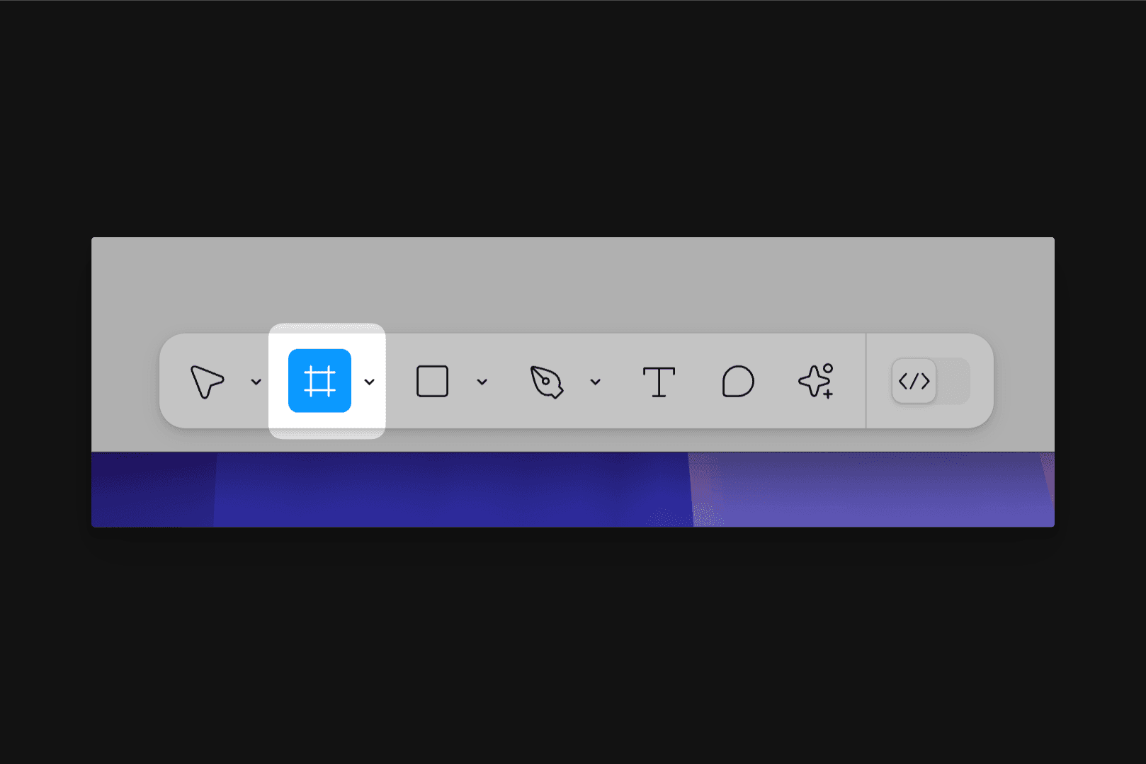
We can create frames by tapping F on the keyboard or navigating to the new toolbar near the bottom of Figma—just look to the far left for the frame tool. Once selected, we can either choose from a preset size from the Properties Panel on the right, or we can manually create a frame on the canvas or inside an existing frame, adjusting it to the needed size.
✏️Tip: Frame sizes can always be adjusted after being placed on the canvas. With the frame selected, choose the ‘Frame’ dropdown at the top right in the Properties Panel to see all of Figma’s preset sizes.
Oh! And here’s something great about frames within Figma. Not only can the frames we create hold all of the content of our design, but they also allow for all of the same styling properties that objects and shapes can have, such as fills, strokes, and effects. This means we can substantially simplify our layer list as we design.
For example, if I create a button without a frame, I’d first need to draw and style a rectangle, add text, center align everything, and then group the layers together so everything can remain connected. With frames, however, I’d only need to make the frame, add the proper styling to that frame, and then place the text layer within that frame. This reduces an entire layer, which may not sound like much but can add up throughout an entire component library. And because it’s no longer necessary to click into our group to find the shape if we need to adjust our button’s appearance, we can also work a little more efficiently.
✏️Tip: When a frame is placed within a frame, it’s created without a fill applied.
Constraints
If we think of frames as containers that hold the various objects and layers of a design, constraints are the tool that lets us specify the positioning for those layers or objects if the container they sit within should ever grow or shrink in size. Constraints are only available for objects placed within a frame and won’t be accessible when using a group. A group will inherit its size based on the size of the objects within it.
With an object that’s inside of a frame selected, constraints can be found within the Properties Panel on the right-hand side of Figma, and we have several options to choose from. Figma lets us pin objects to the left, top, right, bottom, center, left + right, or top + bottom. Or, with no constraints selected, we can let the object scale and adjust its position as a percentage of the frame’s dimensions.

✏️Tip: Select multiple constraints at once by either using the dropdown menus available to the left of the constraint panel or by holding ⇧Shift and clicking.
To show how constraints can be helpful, imagine we’re working together to recreate a Table Row from iOS, where we have an icon and label on the left side, with a toggle on the far right. This will eventually become a component for us to share with the entire team, and because it will be widely available, we want to ensure that it will work well for any iPhone screen size, from the iPhone 13 mini all the way up to the iPhone 16 Pro Max, and eventually, the iPhone 20 Pro Max Ultra Plus.
I’ll begin by selecting the frame tool and drawing a container of the size I need. Because this is a frame, I can apply a background, drop shadow, and even round the corners, too!
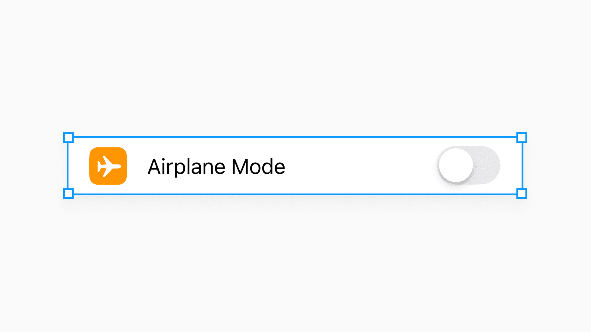
With our Table Row selected, if we try to resize it, we may notice that the icon and label stay over towards the left, but the toggle isn’t anchored to the right side. This frame isn’t responsive. How come?

By default, anything we place inside a frame will have a top-left constraint, meaning as the parent frame resizes, in this case, the Table Row’s container, all objects will stay pinned to the top and left side. Put another way, its X and Y positioning coordinates won’t change.
With one of the nested objects selected, Figma visually displays these constraints in the Properties Panel and on the canvas. It took years for me to notice, but the dotted blue lines we’re seeing represent the constraints that are applied. These lines head in the direction of the constraint.
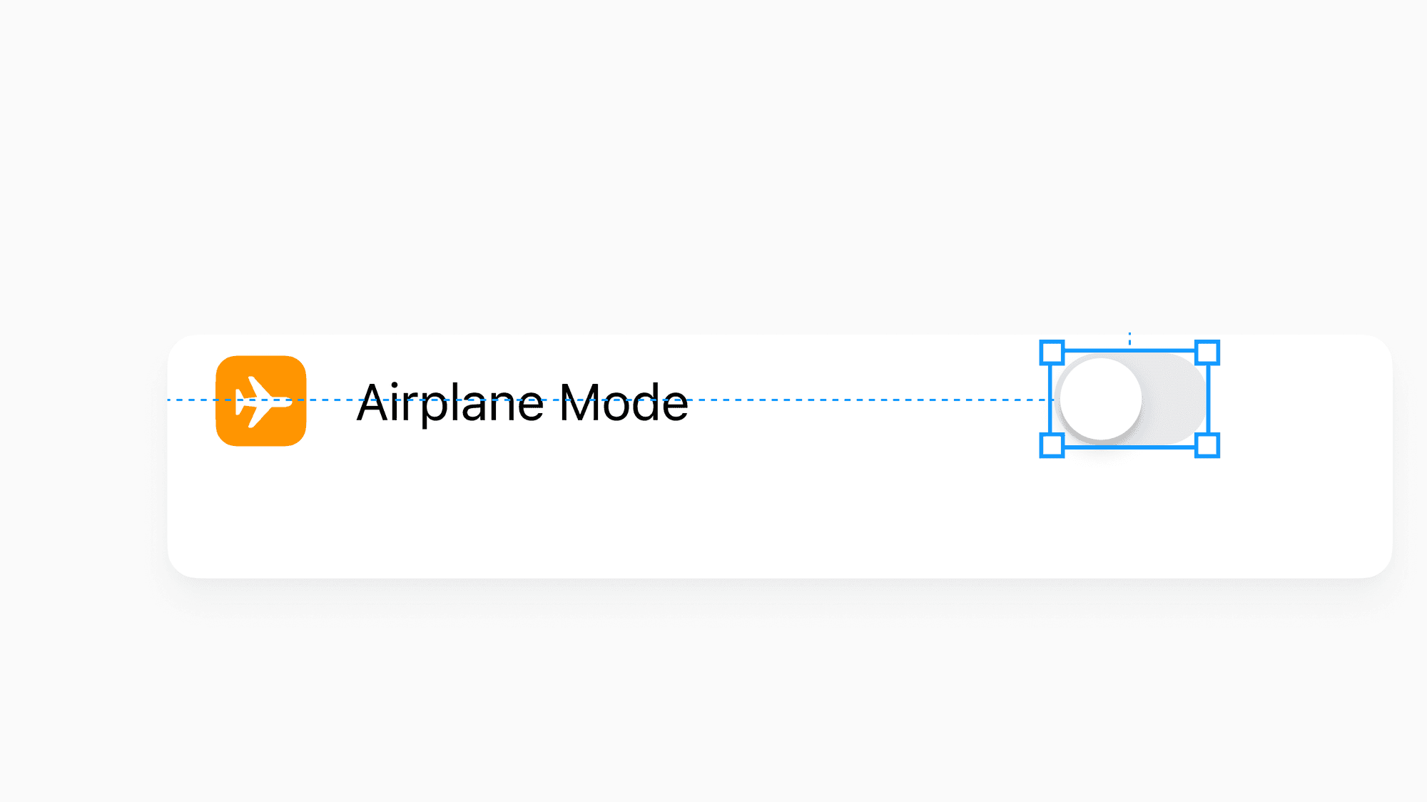
Here, we have a dotted line heading towards the left side of the navigation bar and one that’s going towards the top. It’s a little silly, but what helps me understand what’s happening and why is to think of these lines as tiny ropes that are holding onto and supporting the item, and these ropes can’t change in length.
Knowing our constraints for everything inside of this frame are set to top-left, we can adjust them to help create a responsive component that works as intended for others on our team to use.
The toggle should always stay anchored to the right and centered. With the toggle selected on the right side within Figma’s Properties Panel, I’ll apply right and center constraints.

Next, I’d like for the icon to always remain on the left side but to be centered within the frame instead of pinned to the top. For this one, I’ll apply left and center constraints.

Finally, the label should remain vertically centered, but I’d prefer for it to stretch left and right to increase or decrease the space available to the label if the Table Row were to expand or narrow. For this one, I’ll hold the ⇧ Shift key and select both left and right, followed by the center constraint.
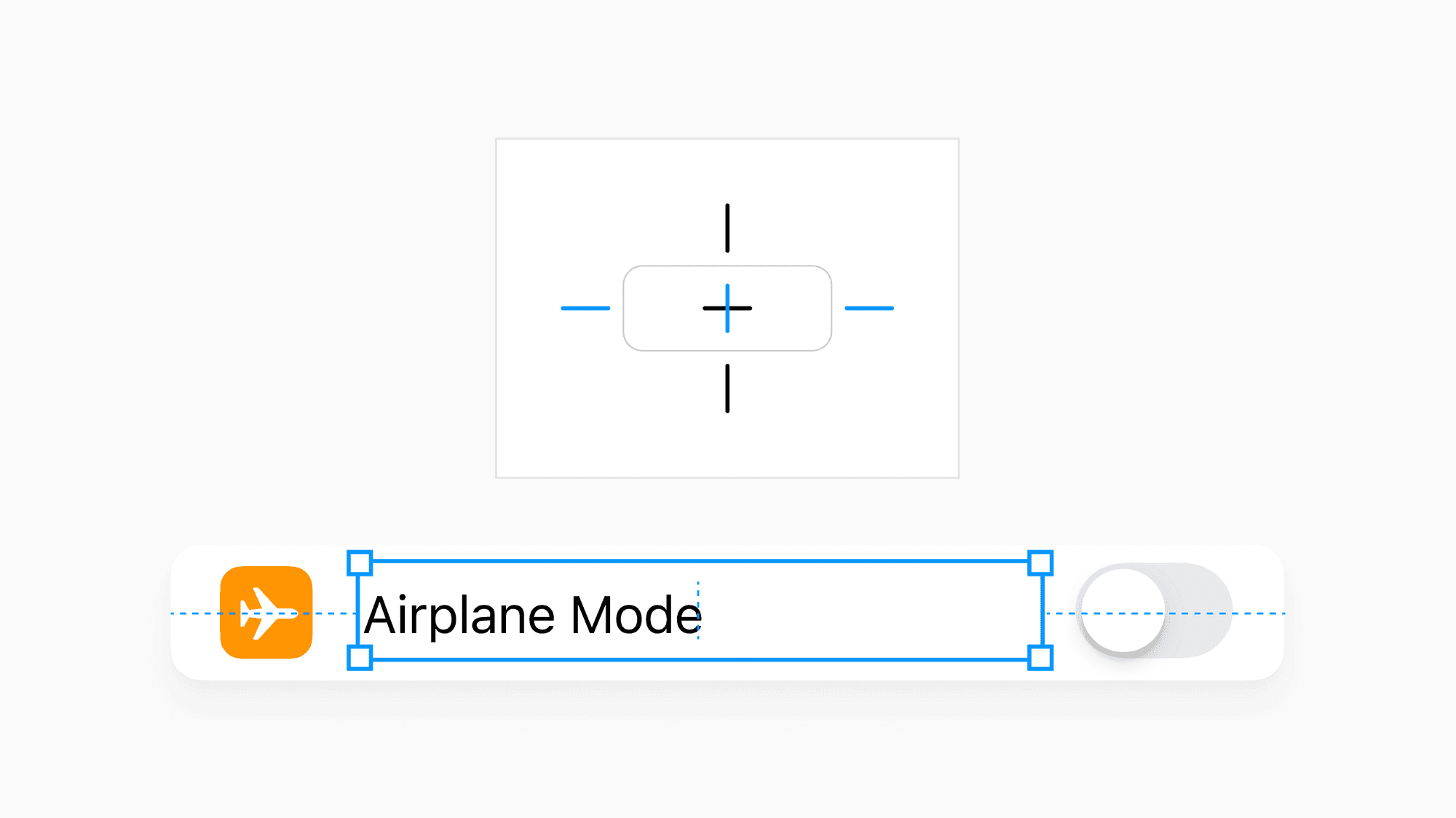
Our blue dotted lines, or our little ropes, adjust to reflect this change, and if we now resize our Table Row, we see it working as intended! Woohoo!
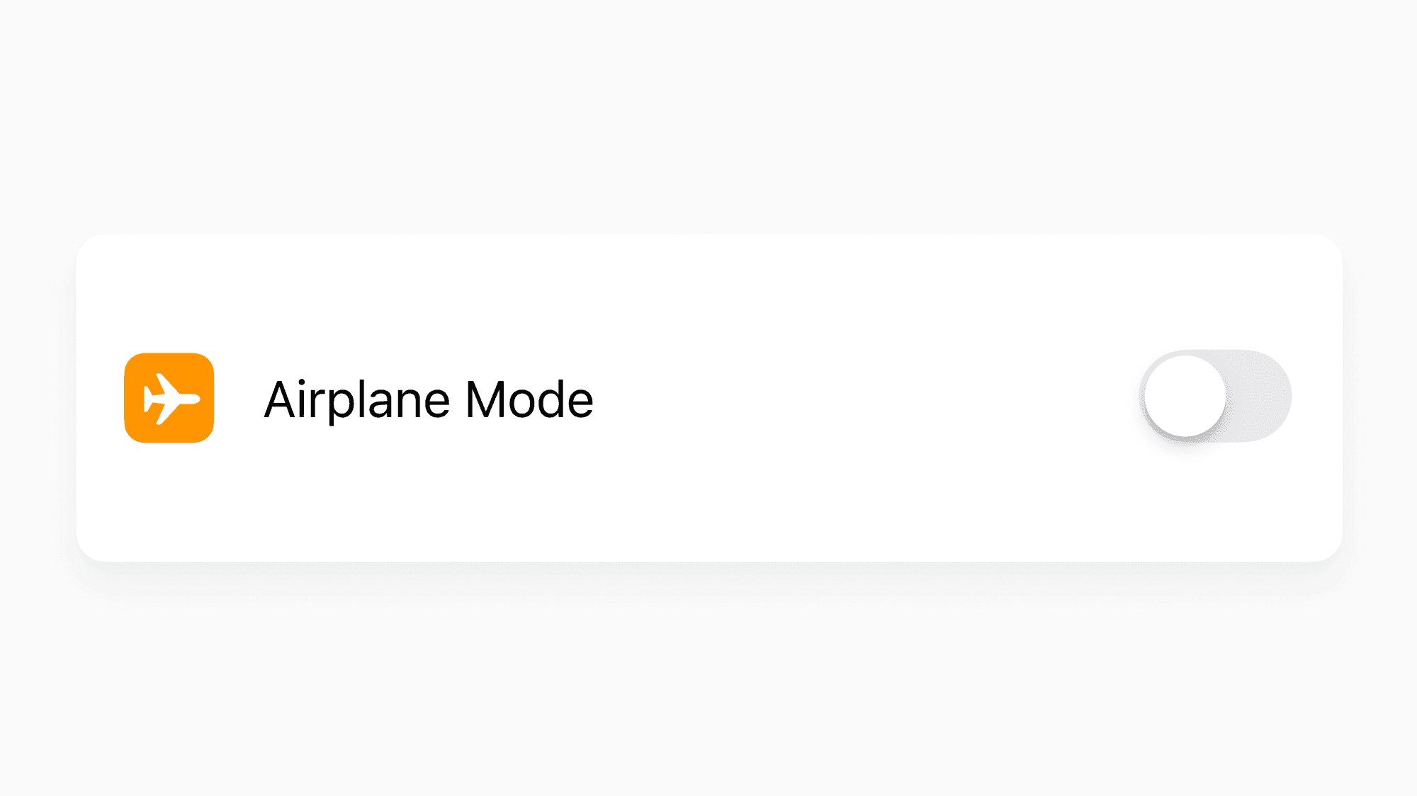
We can now turn this frame into a component for others on our team to use within files and designs of their own, and we now know that should it stretch or shrink, the items within will stay anchored to their respective sides.
While adding constraints may seem like a simple action combined with frames, they are an effective and easy way to ensure that components within your design system’s library will work and scale well for those using them. Perhaps the most challenging part is thinking through how they might be used, especially for more complex components, but if you’re like me, that’s often part of the fun!

